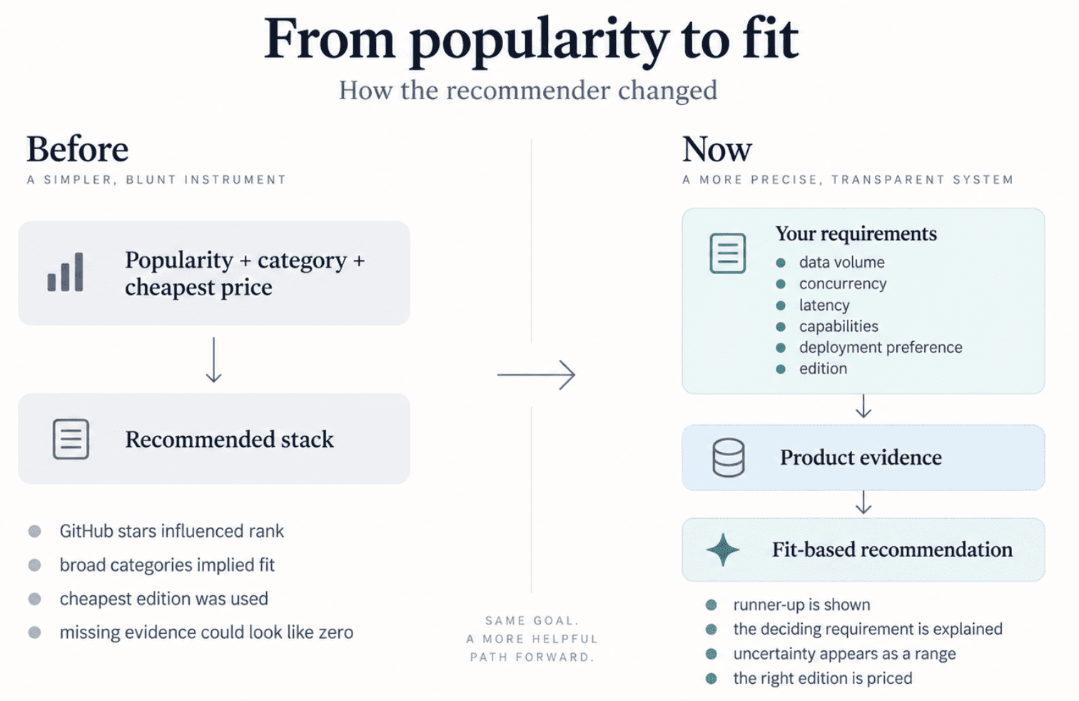
The stack recommender now ranks on how well a product fits your requirements rather than how popular it is, and prices a stack on the edition you would actually buy. Plus alternatives that really compete, comparisons that answer a real question, and a reordered profile page.
EB
Egor Burlakov
••4 min read
The recommender picks on fit, not popularity
Until last week the stack recommender ranked products partly on GitHub stars, package downloads and Docker pulls. That measures how well known a product is, not whether it suits you. Something could win a slot for being popular, and lose one because nobody had recorded a connector for it.
It now scores each candidate on five dimensions of fit against the requirements you stated, and shows a range rather than a single number where the evidence is thin. The old "Stack Score", half of it a scaled star count and labelled as overall fit, is gone.
"Why this recommendation" changed with it. It used to recite adoption figures. It now names the runner-up and the one requirement that separated them, and says plainly when nothing you asked for did.
Questions we could not ask before
Four things our users care about had nowhere to go in the recommendation wizard.
Concurrency, separately from data volume: a terabyte queried twice a day and a terabyte behind a customer dashboard are different products. Latency, separately from real time: data arriving continuously does not mean a query returns in milliseconds. Required capabilities, checked against what a product records rather than guessed from its category. And , which is neither budget nor licence.
edition
There is also one question about how you want to run it, from fully managed to fully self-hosted, with "mostly managed" and "mostly self-hosted" in between. Those two shift the ranking without ruling anything out.
The stack cost charges the edition you would buy
A stack total used to charge each product's cheapest recorded entry point. Your requirements usually point at a higher edition, so the total was optimistic in a way you could not see.
The edition your requirements resolve to is now what gets charged, and it travels in the share link, so a link you send someone restores the same stack at the same edition. When more than one edition fits, the recommender says so instead of defaulting to the cheapest. A price we cannot state per month reads "Pricing unavailable" and never quietly becomes zero.
Integrations got the same treatment. Some we showed as verified could not be traced to a source. Those are gone.
A price lives in one place
Talking about pricing, one price can appear on a tool's pricing page, inside its review, in comparison tables, and in the description Google shows under the result. When a vendor changes it, several pages go stale at once.
Prices now live once, and every page that quotes one is bound back to that source. Change the number and an automatic pass updates it everywhere, editing the figure and leaving the sentence as written. Where the wording is ambiguous — two numbers in a sentence, another currency, no clear link to an edition — it is left alone and passed to a person.
Alternatives that are actually alternatives
The old /alternatives/databricks ranked Neo4j at 10 and TimescaleDB at 8. Neo4j is a graph database. It is not an alternative to Databricks in any universe where the words still mean things.
Alternatives used to be picked by category, and categories are broad. "Data Pipeline" holds 55 tools doing several different jobs, so sharing a shelf was enough to make two products competitors. Every published tool now sits in a subcategory — 300+ tools across 83 of them — and competition is a reviewed decision with a written reason, not an inference. /alternatives/datahub lost six observability and access-control products and kept four real catalogs.
Comparisons that answer a real question
A comparison page now says when two products are not a straight choice. Elasticsearch vs Splunk vs Datadog — a search engine, a SIEM and a hosted observability platform — used to be labelled "Data Warehouses", because all three inherited the same legacy category. It reads "Cross-category comparison" now.
The verdict follows the same logic. Where two products are normally run side by side, the page explains what each one is for instead of staging a contest between them.
Product names also keep up with their vendors. Windsurf is Cognition's Devin Desktop, Google's umbrella "Vertex AI" is not the name of the service underneath it, and a retired name can no longer be written back onto a page.
The profile page, reordered
/tools/<slug> used to open with a hero, twenty comparison tiles and a raw table of signals. The actual explanation of the product came last. It now follows the order questions tend to arrive: at a glance, editor's take, evaluate, product and architecture, pricing, strengths and trade-offs, ecosystem, public signals, external evidence, FAQ.
The editorial star rating is gone, along with the matching rating in structured data. A rating we assign ourselves should not look independently measured. Alternatives moved onto the profile, so a product and its substitutes are one page rather than two.
/tools gained a Type filter, shown once you pick a category, because all 83 types at once would be less a filter than a punishment. Category pages show their own shape too: "ELT Platforms (12) · ETL Platforms (11) · Workflow Orchestrators (7)" instead of a list of eight popular tools.
I hope these updates will be useful for you. Please let me know if you have any feedback for Modern DataTools!
EB
Written by Egor Burlakov
Engineering and Science Leader with experience building scalable data infrastructure, data pipelines and science applications. Sharing insights about data tools, architecture patterns, and best practices.
Explore Further
Dive deeper into the tools and categories mentioned in this article.